Hydraid — Feel the Hy.
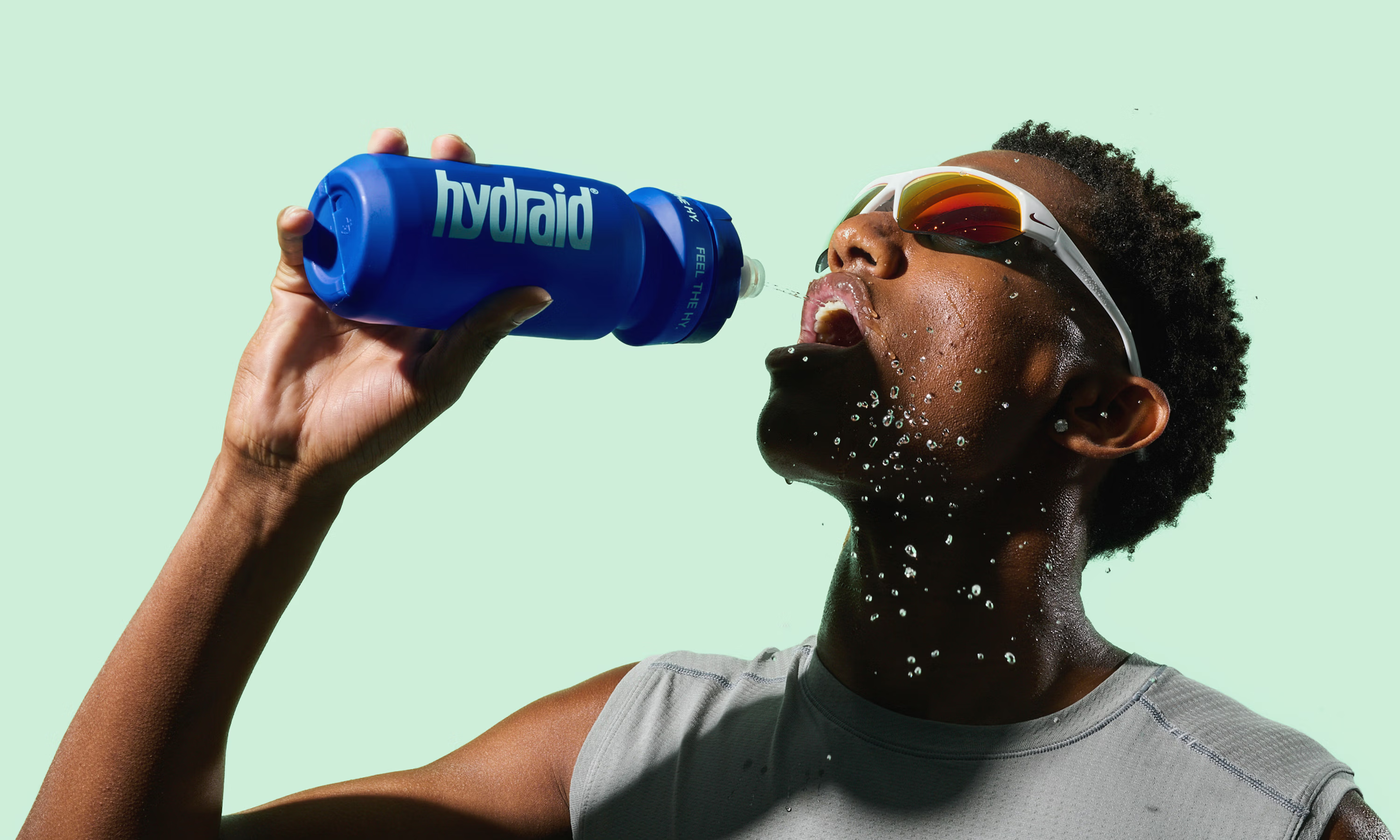
Germany's leading electrolyte brand, Hydraid, is here to give the body back what sport takes away. Rather than reducing rehydration to its lab formula the brand puts the feeling front and centre: the effort, the exhaustion, the comeback. A new generation of hydration built for the Everyday Athlete; for anyone who trains, sweats and gets straight back up again.
Working closely with the Hydraid team, our task was to turn their strong science into an equally strong feeling. Turn a functional supplement into a sports brand people actually want to reach for. Together, we sharpened the positioning, gave it a new claim “Feel the Hy” and built one holistic system across identity, packaging and website. The result is a brand that turns rehydration from a fact you read into a feeling you chase.
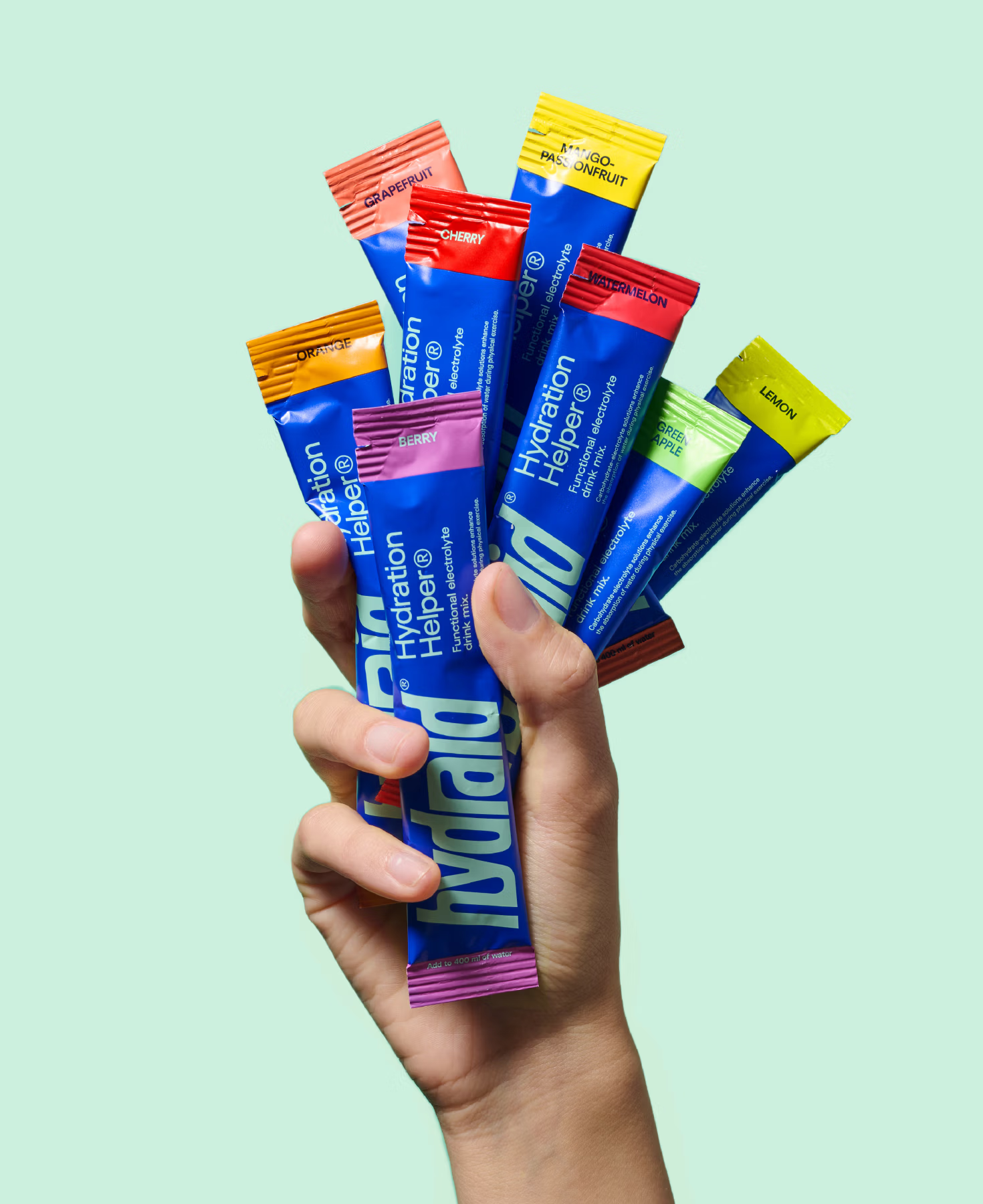
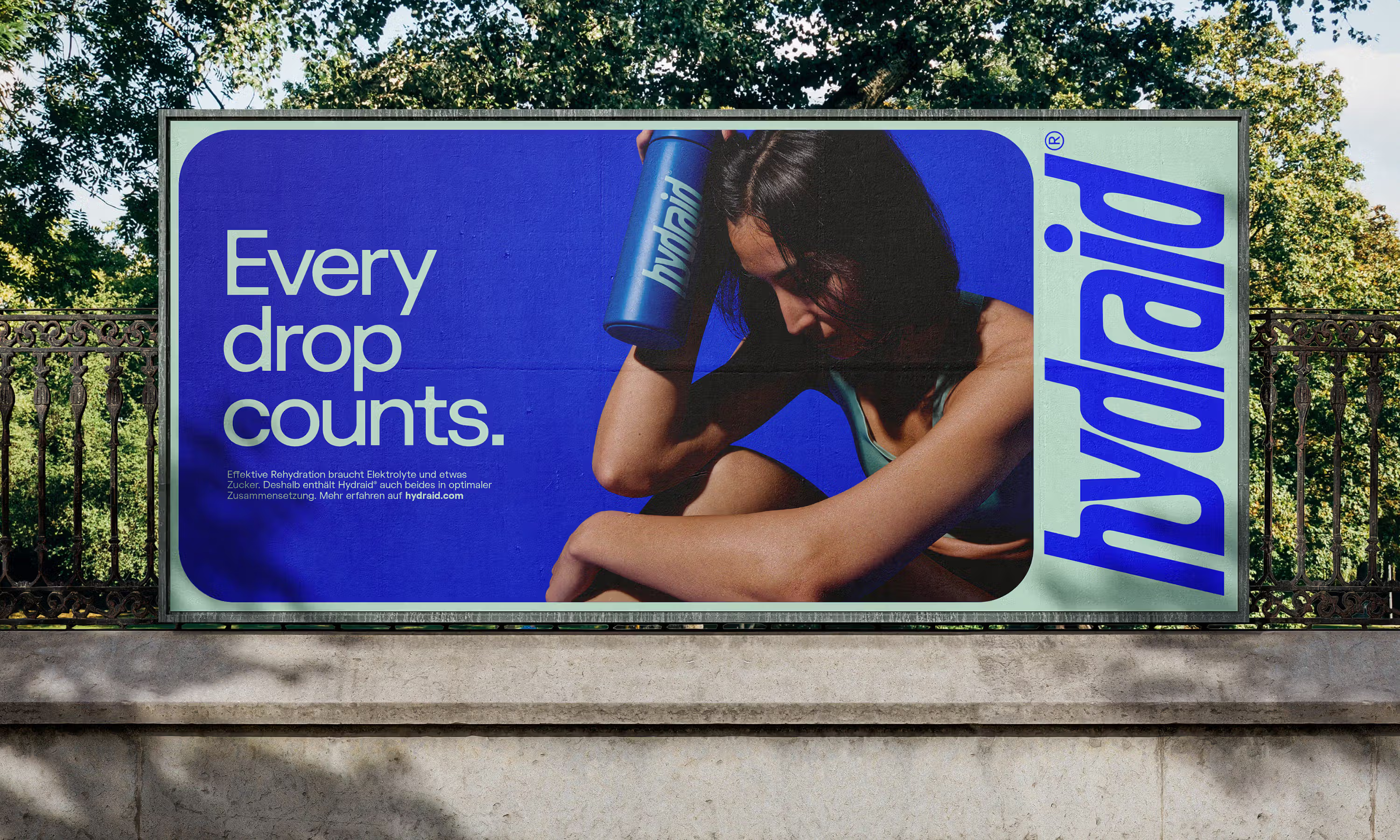
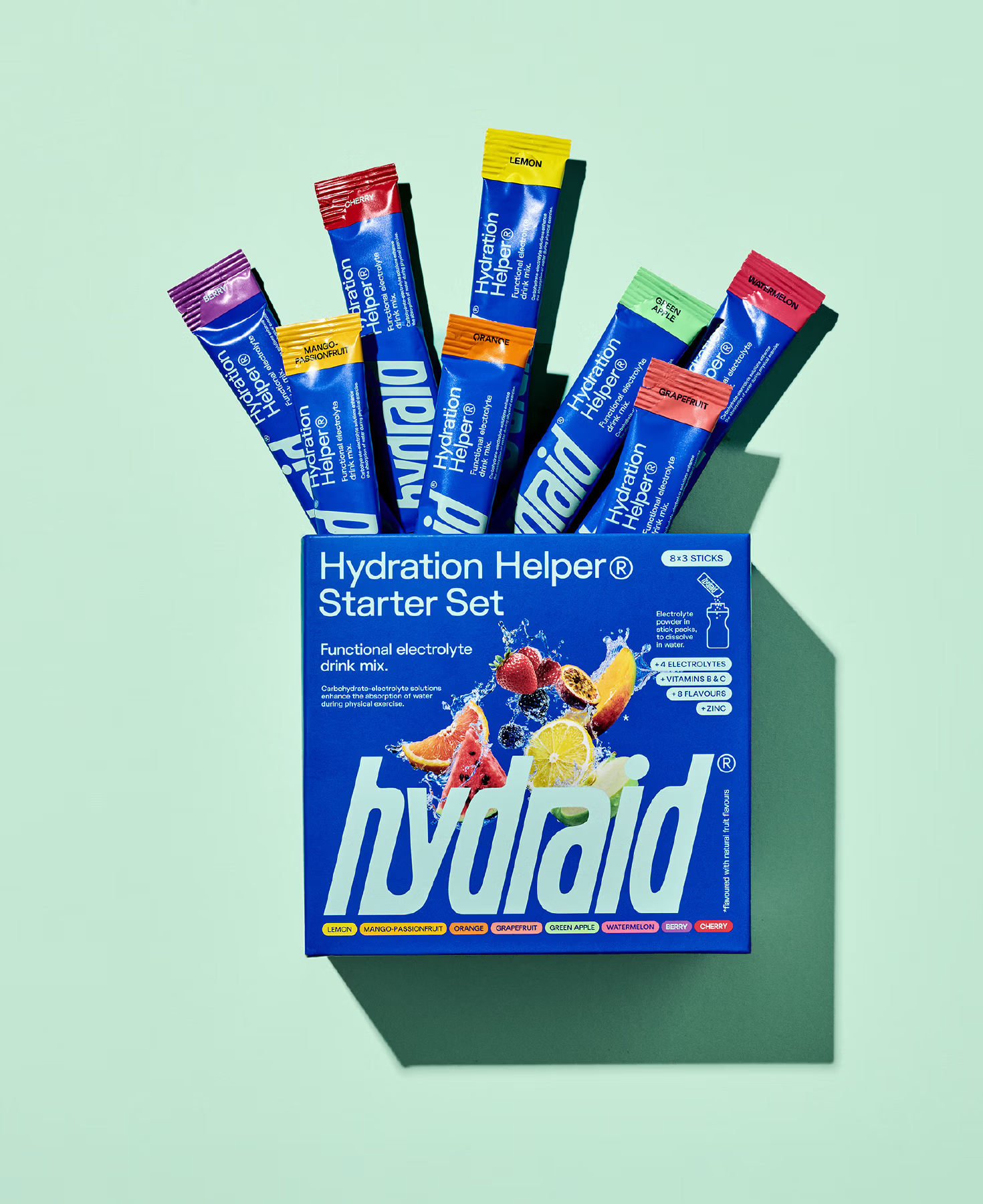
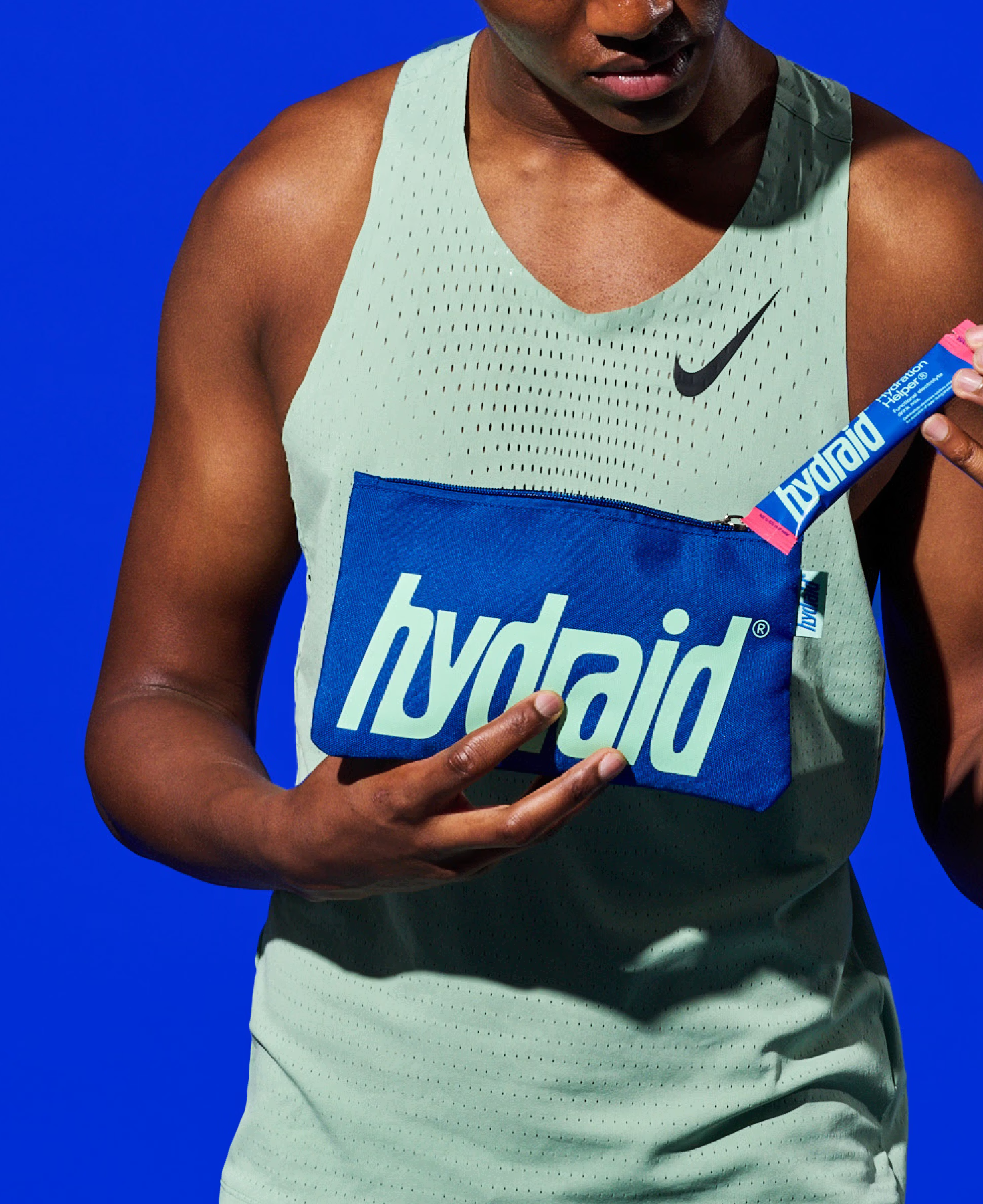
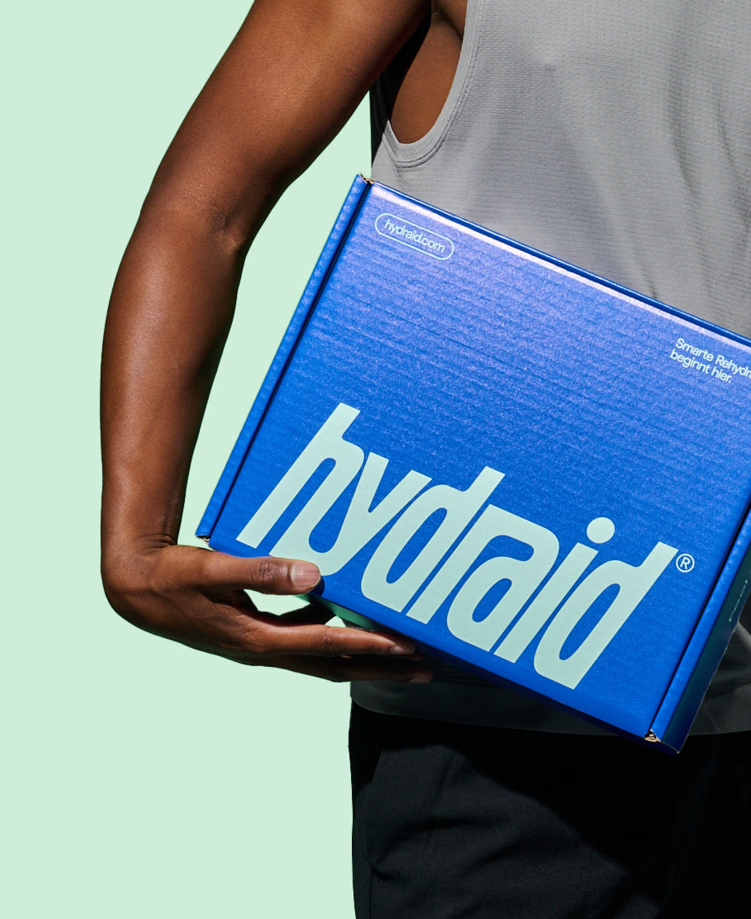
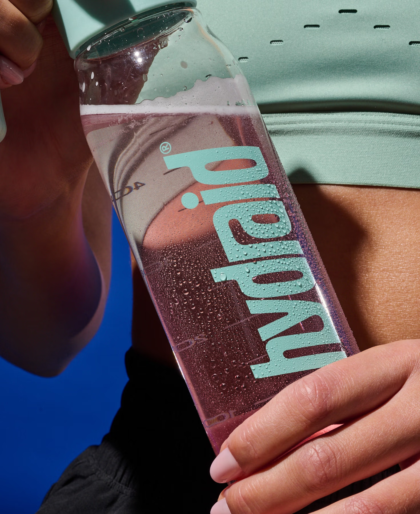
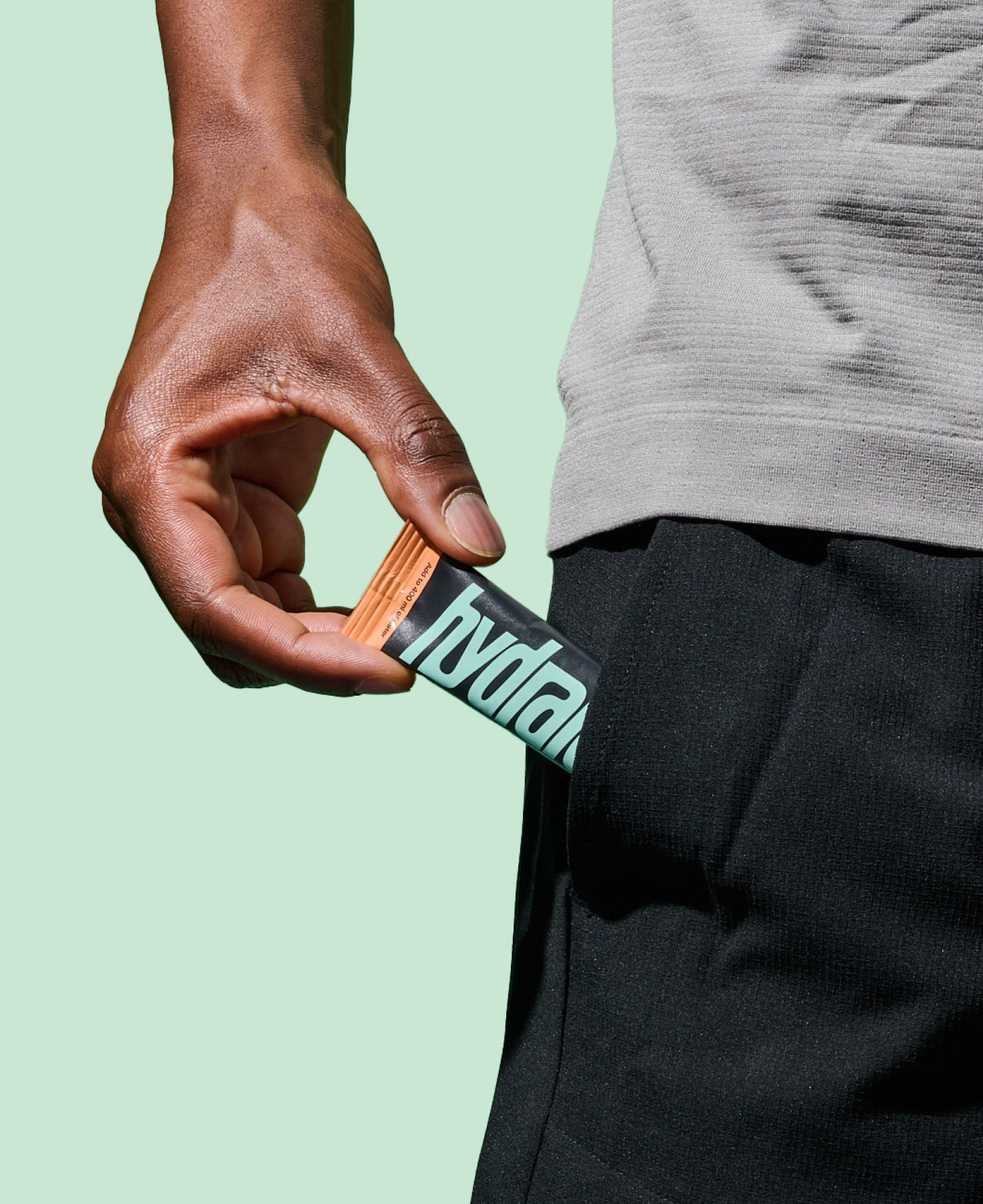
Where the previous identity leaned on a separate icon, the new wordmark carries the whole system alone: bold, fast and powerful. It runs in a cool mint against a signature blue, a reversible duotone that stays unmistakable on a pouch, a billboard or a bottle. The product portfolio is designed to carry every flavour, each marked with its own colour cap. The new visual world combines real sports photography with AI-generated imagery, swapping the category's usual clinical white for something that actually looks like sport. Fuego Fonts’ typeface “FG Futurist” perfectly complements the brand design system by adding dynamic and some liquid details.
Working closely with the Hydraid team, our task was to turn their strong science into an equally strong feeling. Turn a functional supplement into a sports brand people actually want to reach for. Together, we sharpened the positioning, gave it a new claim “Feel the Hy” and built one holistic system across identity, packaging and website. The result is a brand that turns rehydration from a fact you read into a feeling you chase.
Where the previous identity leaned on a separate icon, the new wordmark carries the whole system alone: bold, fast and powerful. It runs in a cool mint against a signature blue, a reversible duotone that stays unmistakable on a pouch, a billboard or a bottle. The product portfolio is designed to carry every flavour, each marked with its own colour cap. The new visual world combines real sports photography with AI-generated imagery, swapping the category's usual clinical white for something that actually looks like sport. Fuego Fonts’ typeface “FG Futurist” perfectly complements the brand design system by adding dynamic and some liquid details.
Brand Story
Positioning & Claim
Brand Design
Logo Design
Packaging Design
Art Direction Photography
AI Generative Prompting
Website Design
Positioning & Claim
Brand Design
Logo Design
Packaging Design
Art Direction Photography
AI Generative Prompting
Website Design






More projects